Best Image Size for Mobile Website


Mobile phone is the most handy and quick way to surf the internet. This is why 92.3% of internet users access the internet using mobile phones. Would anyone trying to get huge traffic on their website ignore this mass audience?
To satisfy this 60% audience of a website you must have perfect images for mobile websites. Without a clearly set size, an image just won’t look its best. Apart from the visual appeal images are also important for conversion, website speed, and authenticity.
To ensure any of those aspects would not go wrong find out the best image sizes for mobile websites and start applying now!
Importance of Image Optimization for Mobile Website
Optimizing images on a mobile website brings various benefits to your website. Benefits go beyond the accessibility of different devices to customer satisfaction. Optimizing images for mobile websites will ensure the smooth operation of websites and reduce loading time.
64% of your website’s weight is made of images; so if you neglect optimizing images on your website you are likely to lose 40% of the potential customers due to slow speed.
Image optimization will help you with SEO and make your webpage appear on search results. It is proven that 32.9% of Google search results are returned with image results. If you have relevant images then it would help you greatly with the overall SEO.
Best Image Sizes for Mobile Websites
Making images perfect for your mobile website is not something you can neglect. Especially when your users are supposedly using the website on their mobile. To make sure the majority of your audience gets the best experience and sees images properly set it to a perfect size.
Here are some of the image size recommendations that are commonly used:
Website Background Image
Background images are the largest image on the whole website. These images are used as a backdrop or to emphasize some of the contents. It is not easy to measure the perfect size of a background image, although it is very important.
Background images contain some exclusive information that is crucial for conversion. If you are not sizing your background images size according to the recommended size, there is a possibility your images will turn out blurry. Either the website will shrink the background image automatically or not show the image at all.
The recommended background image size for mobile websites is 525x934px. Resize your background image if you have not yet.
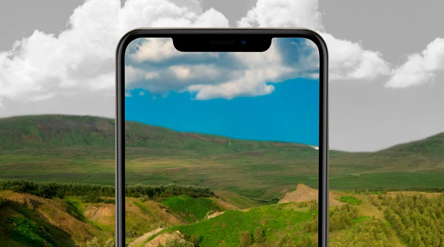
Hero Image
It is crucial to ensure how hero images look on a desktop but you cannot ignore the look on your mobile screen. Hero images must be responsive in mobile too, so visitors can acquire the full essence of your website.
You can use videos on hero sections too, but on mobile websites that might not be the most pleasing thing. It is better to use static images for hero sections.
The recommended size for a hero image is 360 x 200px.
Banner Image
Banner images are mostly used for ads. Mobile ads are very common because of their faster reachability. 60% of the total digital advertising is spent on mobile ads. So having a well-structured image on the ad banner gets the most importance on your website.
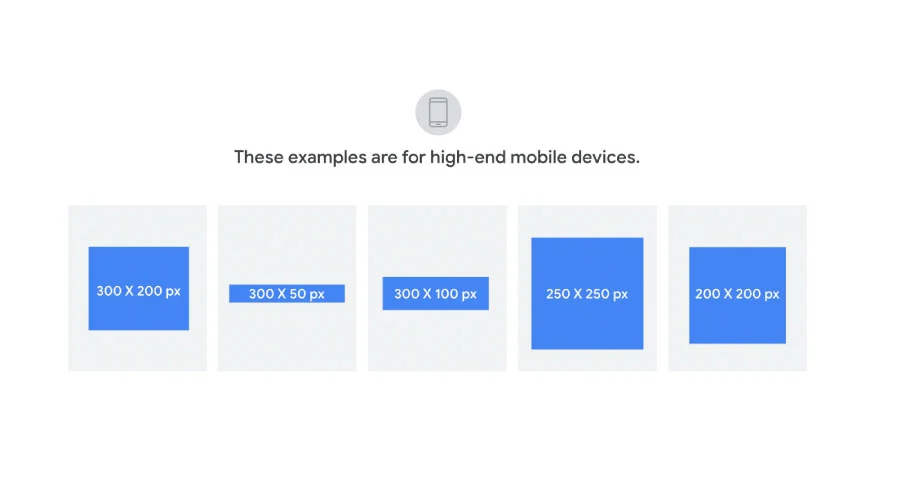
In most cases, mobile banner images are shown at the top or in the bottom of the website. These banner images can be of various sizes but the most common sizes used are, 320×480, 300×250 and 320×50.
Apart from them, 320×50px size is one of the most popular banner image sizes for mobile ads.
Logo Image
In a website showing a clear logo of your company directly connects to your company value. If your logo appears cracked or blurry it may convey as shady to the customer. Having consistent logos throughout can increase revenue by 23%
Having a proper logo size to fit on a mobile website will solve the issue with the logo. Most commonly 60 x 60px (square) and 160 x 40px (rectangle) sizes are used for logos on mobile websites. This fits perfectly on the website and does not appear as shady.
Lightbox Image
Lightbox images give a closer look to the selected images. This can be helpful for product images and things that must have details to attract customer attention.
Lightbox images on mobile websites should be 1600x500px> in most cases. With an aspect ratio of 16:9.
Slideshow Image
Slideshows are for showcasing elements like a gallery on a website. That way it is possible to show a range of images without much trouble.
If you are not using the right-sized image though, it might not appear on the website. A width of 800px and a height of 800px is used for mobile slideshow images.
This appears perfectly on the mobile website without any cracks or blurs.
Blog Images
Blog images are used inside the blog to emphasize different aspects. This adds value to the blog and helps with the SEO.
Blog images should be 360 x 240 px for mobile websites, so they can appear on mobile without being cut down.
This image size will help the reader’s visibility and overall appearance of the blog.
Image Optimization for Mobile Websites
To show your website faster and nicer on mobile you must optimize images. To optimize images for mobile websites you can follow the things listed.
Choose the right format: choosing the right file format for your image can save a lot of space and make the website faster. The most popular image file formats for mobile are JPEG and PNG.
They are known for their faster loading time and short file size. If your images are not already jpeg or png then turn it into one of those.
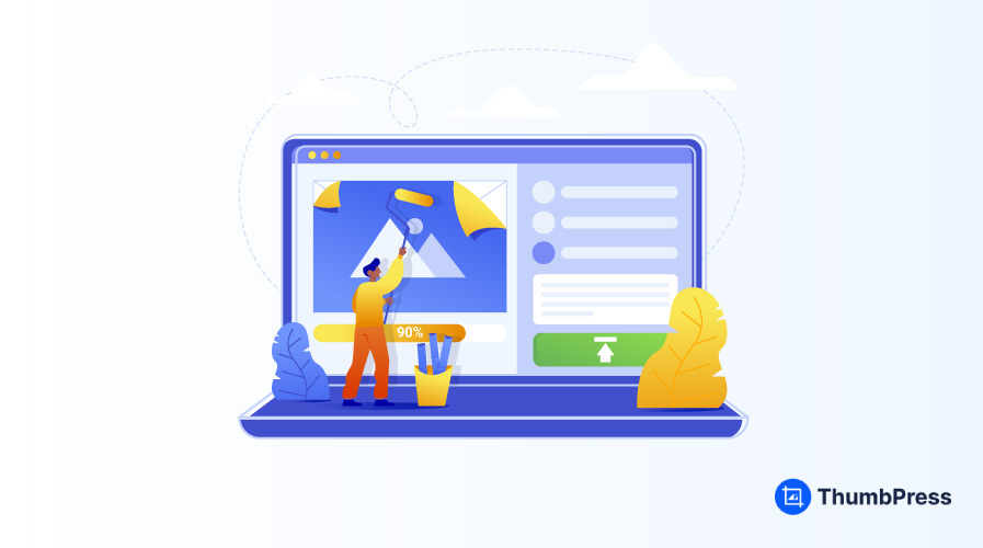
Compress Images: image compression can cut down your image size by 90%. This weight relief will ensure faster loading and more usage of images. To optimize the image you can use three varieties of compressions. Lossy compression, Lossless compression, and Glossy Compression are the three types of compression that can be made.
To compress your image on any of your WordPress websites use a plugin that will ensure better quality and perfect compression.
Use CDN: Use a content delivery network in mobile to ensure the best delivery of images. This will build a shorted connection between the user and the original server making sure the images load faster on mobile websites.
Wrapping Up
Mobile is the most popular path to get visitors to your website, neglecting any aspect of a mobile website will directly hamper a wide consumer. Since images have a huge impact on your website this needs to be the center of your attention.
Mobile website images have different sizes than any other devices. To ensure image sizes do not hamper your overall site performance optimize them and take the perfect-sized ones. With the guide to hunting down the best image size on a mobile website, you will not need to hustle anymore. Take a look at the blog to have a clear understanding.
Subscribe to Our Newsletter
Get the latest WordPress tutorials, trends, and resources right in your inbox. No Spamming, Unsubscribe Anytime.

Thank you for subscribing to our newsletter!