
Best Image Size For Website – A Complete Guide


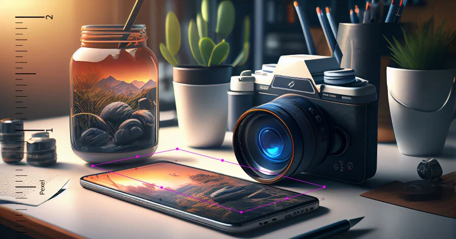
What’s a better way to catch user attention than a high-quality image?
In the digital era, images are resources to define your website interface. With quality images, you can grab users’ attention and keep them engaged to your website. But to achieve this, the images must be of the right size and quality.
With screens becoming bigger every year, choosing the right image size becomes even more crucial. Since there are multiple image sizes, each fit for different websites, it’s easy to get confused and sidetracked.
But don’t worry! With our guide to the best website image size, you will get a clear understanding of how you can choose the best image size fit for your site.
Importance of Image Size for Website
Having the perfect image size for your website is essential. Large images are counteractive to the website’s overall speed and performance. If image sizes are not carefully controlled, they can take up valuable server space.
So, there are various reasons to find the best image size for your website. Let’s explore some of them:
- Website Speed: Large images can slow down your website, which can frustrate users. To avoid these kinds of issues and keep the website running smoothly, choosing the right image size is the first step.
- Better User Experience: When you have the perfect-sized image for your website, users can experience the best from your website. If the picture is not the right size, even if your website is running nicely, low pixels will take away from the experience.
- Helps in SEO Ranking: With the right image size, CMS bounce rates drop, and get in the way of your SEO ranking. As Google uses a host of metrics for ranking, image size is definitely a factor.
Most Popular Image Sizes
In different areas of your website, you will use different image sizes. In this section, we will be discussing some popular image sizes that most people commonly use.
Background Images
Background images are also known as full-width images. This is generally the largest image that can be uploaded to sites. This kind of image is used to cover a whole area and acts as a backdrop to a landing page.
The size varies from 2400 x 1600 to 2560 x 1440. And the ratio can be around 16:9 with an image size of below 20MB.
Background image adds dimension to the page and attract attention to a specific section. You can add up to 2560 pixels to 1440 pixels as long as you are using 72 pixels per inch. If you upload the background image to the right size it will shrink or extend depending on the device size.
For the background image, it is best to choose a high-quality, wide-angled image keeping the size as low as possible.
For image compression, you use WordPress plugins. We recommend using ThumbPress, which is best for image compression and many other image-related issues for your WordPress website.
Hero Image
Hero sections feature important texts and grab attention, as soon as a user visits your site. Some people often think hero sections and background images as the same but they have different measurements.
Hero images are usually half the background image. It is best to choose an image that is between 1280/700 and 2500/900.
To maintain the ideal loading time of a website(ideally under 2 seconds), images need to be organized and load fast at the same time. Which is why it is best to maintain 72 pixels per inch (PPI). Although the images are compressed according to the device display, you can make an image size of 800px by 1200px for mobile users to see the hero section better.
Inside Blog Image
Blog images are used to give a better understanding of the text and relate readers to it. Different types of images can be used inside a blog depending on the position and the value of the image.
Since different types of images are used in a blog, the sizes are also different for those areas. When you want to attract the users’ attention to the image more, use a banner-sized image which is also called a featured image.
The ideal size for large images is 1200px by 620px. For landscape, the size should be 1200px by 900px, and portrait images should be around 900px by 1200px. If you are trying to put more focus on the text and less on the blog, smaller images are best. The ideal image size for small images is 894 x 462 pixels.
Blog images have to be ideal for all kinds of devices, and can be shared across all social media platforms. Recommended file size for inside blog images is at most 150kb.
Banner Image
Banner image sizes depend on where they are placed on the websites. The most common type of banner image is an ad banner. If you intend to include a banner image as an ad on your website you can follow Google ad size guidelines for setting the perfect image size.
If the image is not for an ad, there are different image sizes you can use. The most commonly used sizes are vertical, portrait, half/full page, square, and skyscraper. Among all of them, square images (250px by 250ps), rectangular images ( 300 x 200px or 970 x 90px), and skyscrapers (160px by 600px) are best suited for all types of websites.
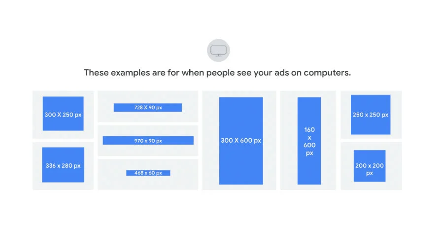
While adding banner images on the website keep the focus area in the center to avoid any type of cropping and the file size as small as possible.
To show ads on mobile display the ratio should be 1:9, 1:1, 1:1, or 4:5; keeping the image show around 150kb.
Logo image
Logo images are generally considered to be the smallest image on your site. This is the most important image because reinforces your brand identity and showcases professionalism to the users. Logo images need to be very clear and load faster without any complications.
Generally, logo images are uploaded as square images or rectangular. The aspect ratio can be 1:1, 2:3, or 4:1, or 100px by 100px.
Favicon image
Favicon images are shown on top of the website next to the webpage title in the browser tab. Favicons add value in making your website look professional.
The most popular sizes for favicon images are 16px by 16px, 32px by 32px, or 1:1. These are the most common sizes that any browser uses to display favicon.
However, if you do not want to display a stretched image, it is best to create multiple sizes with a 1:1 ratio.
Finding Out the Best Image Size for Websites
Depending on which platform you used to build your site, the image sizes will be different. If you are using any CMS like WordPress, Shopify, or Wix, you have to use the recommended image sizes.
Working with these guidelines may seem daunting, but we’ve outlined the requirements for each platform below –
WordPress
WordPress has full documentation for its users to know the best image sizes for their users. Here are the recommended image sizes on the WordPress Guideline:
- Background Image – 1920px by 1080px
- Header Image – 1048px by 250px
- Feature Image – landscape 1200px by 900px; portraits 900px by 1200px
- Blog Image – 1200px by 630px
- Logo – 200px by 100px
- Thumbnail image – 150px by 150px
The image size should not be more than 150 kb except for large images.
Shopify
For a responsive Shopify website, a perfect-sized image plays an important role. Shopify has clear guidelines on image sizes.
- Background Image – 2560px by 1400 (desktop); 360px by 640px (mobile)
- Hero Image – 1280px by 720px (desktop); 360px by 200px (mobile)
- Banner Image – 1200px by 400px (desktop); 360px by 120px (mobile)
- Blog Image – 1200px by 800px (desktop); 360px by 240px (mobile)
- Logo Image – 400px by 100 (rectangular) 100px by 100px (square) for desktop; 160px by 40px (rectangular) 60px by 60px (square) for mobile
Any image larger than 20 MB will impact your overall website speed dramatically. Try keeping the image size smaller and render for making images smaller than their upload size. Anything around 500kb is good to go.
Wix
For websites using the Wix platform, the guidelines are as follows –
For OG Images
- The image size should not be more than 1200px by 60px
- Image sizes should be at least 200px by 230px
- It is best to keep between 600px by 315px
- The file size must not exceed 8MB
For Cover Images
- Side by Side – 940px by 726px
- Tiled – 940px by 186pxminimum; 940px by 1456px maximum
- Magazine – 940px by 940px
- Editorial – 940px by 534px
- One Column – 940px by 400px
Custom Websites
For any custom website, detailed documentation is generally provided for the best image sizes. Or you can simply visit the website right-click on the image and hit “inspect” to see any of the image sizes.
Image Optimization Best Practices
Before uploading an image to your website, make sure the image follows the required image size. Following the best practices can enhance your image use even more without losing website speed.

Best Practices
The best practices for image optimization include –
- File Type: For images only .jpg, .gif, WEBP, or .png is used. You cannot use pdf, .psd, and .doc files for uploading images on any website.
- File Size: All the website’s image file size is limited to 20 MB. it is best to keep the image file size up to 500kb for better load and speed of your website.
- File Name: use letters, numbers, underscores, or hyphens for the image name, and avoid using question marks, percent signs, and ampersands. They might end up causing unexpected issues.
- Pixel Size: The image pixel width should not be more than 2500px on your website. While uploading an image with less than 1500px can cause blurry pictures.
- Color Mode: RGB. CMYK color mode does not appear on the website and appears with complications if applied.
While uploading images on the website optimize them for better results. Some mandatory optimizations are:
Image Compression
Image compression helps to showcase a high-quality image without making it too big for loading. When the image is compressed, similar pixels are merged and all the metadata is removed. As a result, the file size comes down to a minimum.
Image compressions help with load time, speed, and bounce rate reduction; while also contributing to SEO optimization at the same time. Although the image size is reduced with image compression, viewers will hardly notice the difference.
For image compression in WordPress plugins like ThumbPress can be used. Which effectively reduces image size and keeps a quality image intact.
SEO Image Optimization
Images that have been SEO optimized can bring in leads from all around the world. This not only makes your website appear in searches more often, but it also increases website speed, and storage space, providing a seamless user experience.
Search engines prefer images that are unique to the platform and make them appear on the searches for people actively looking for the topic. Also, images are great for giving a clear understanding of your content to your users.
Some best practices for image optimization can help boost your website and overall visibility. Here are some of the best practices for SEO image optimization –
- Creating Unique Images
- Using Relevant File Name
- Using Appropriate ALt Text
- Create High-Quality Images
- Reduce Image File Size
- Making Images Mobile Friendly
- Set Images to lazy Load
- Optimize Images for all Social Media Platforms
Final Thoughts
Images aren’t just for making a website more aesthetic, they play a major part in keeping your site running smoothly whilst bringing in more visitors. Images are responsible for a big portion of the overall performance, ranking, and speed of the website. With an array of devices and screen sizes, it is not easy to determine one perfect size for an image. There is no one-size-fits-all, yet there are common grounds.
With our comprehensive blog, your hunt for the best image size for a website will come to an end. From perfect image sizes to optimization, everything has been outlined here.
Subscribe to Our Newsletter
Get the latest WordPress tutorials, trends, and resources right in your inbox. No Spamming, Unsubscribe Anytime.

Thank you for subscribing to our newsletter!


1 thought on “Best Image Size For Website – A Complete Guide”
Leave a Comment
Table of Content
- Importance of Image Size for Website
- Most Popular Image Sizes
- Background Images
- Hero Image
- Inside Blog Image
- Banner Image
- Logo image
- Favicon image
- Finding Out the Best Image Size for Websites
- WordPress
- Shopify
- Wix
- Custom Websites
- Image Optimization Best Practices
- Best Practices
- Image Compression
- SEO Image Optimization
- Final Thoughts

Thanks for sharing. I read many of your blog posts, cool, your blog is very good.