Your site looks perfect on your laptop. Then you open it on your phone, on mobile data, and the images crawl in one grey box at a time. Learning to optimize images for mobile fixes exactly that, and this guide walks you through nine steps.
That is the version most of your visitors see. Mobile now makes up 60.11% of worldwide web traffic, according to StatCounter’s September 2026 data. And HTTP Archive’s 2025 Web Almanac found that only 60.87% of mobile websites meet Google’s 2.5-second loading target. On 76% of mobile pages, the biggest element on the screen is an image, so images often decide that score.
Most fixes take minutes, and ThumbPress handles many of them for you.
What Is Mobile Image Optimization?
Mobile image optimization is the process of preparing images so they load fast and look sharp on phones. It covers resizing, compression, modern formats such as WebP and AVIF, responsive markup, lazy loading and CDN delivery. The goal is the smallest file that still looks good on a small screen.
Why Should You Optimize Images for Mobile?
It matters for three reasons: most visitors use phones, slow pages lose them, and Google reads the mobile version of your site first.
Phones Pay More for Every Byte
A phone has a smaller screen, a weaker processor and often a slower connection than your laptop. Web Almanac 2025 data puts the median mobile homepage at about 911 KB of images out of 2,559 KB in total. That is roughly 36% of the page.
Slow Mobile Pages Lose Visitors
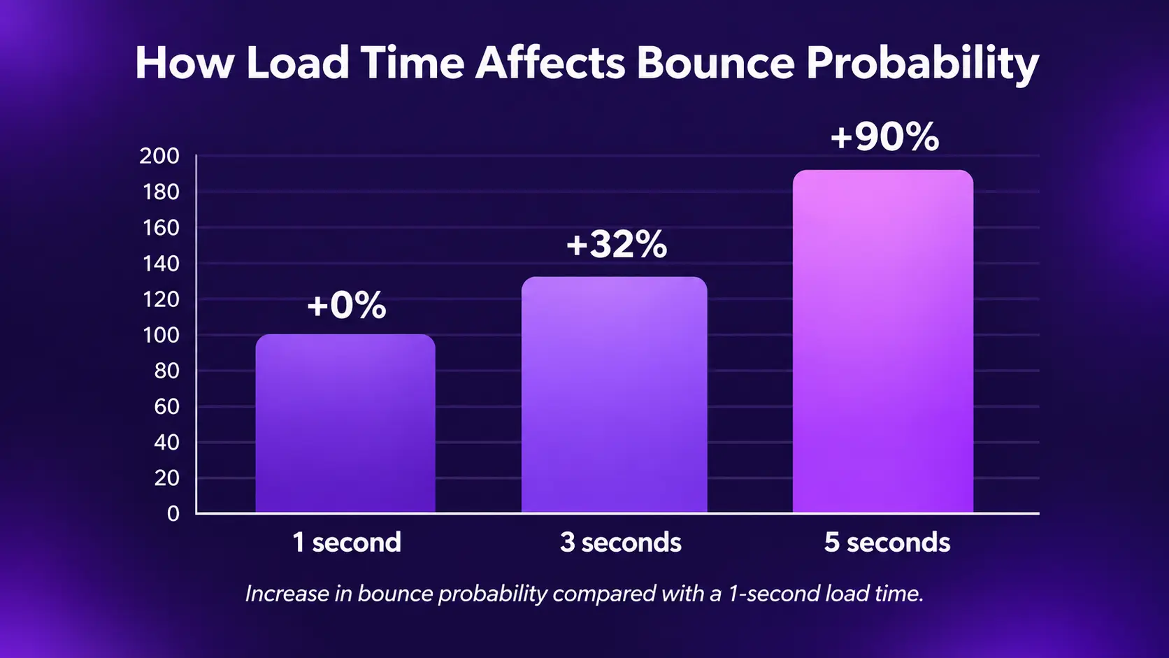
Google’s 2017 research on mobile landing pages found that when load time moves from one second to three, the chance a visitor bounces rises by 32%. At five seconds, it rises by 90%. A Portent study of just over 100 million page views found a one-second page converted about 3 times better than a five-second page for lead generation and about 2.5 times better for ecommerce.
For a store, the cost adds up quickly, as the hidden revenue cost of unoptimized WordPress images shows.
Google Judges Your Mobile Site First
Google uses the mobile version of your pages for indexing. Its mobile-first guidance tells site owners to provide high quality images, use a supported format, keep the same alt text as desktop and use the same image URLs on both versions. Heavy, blurry or missing mobile images hurt your Core Web Vitals and your rankings together.
9 Ways to Optimize Images for Mobile
1. Test Before You Optimize Images for Mobile
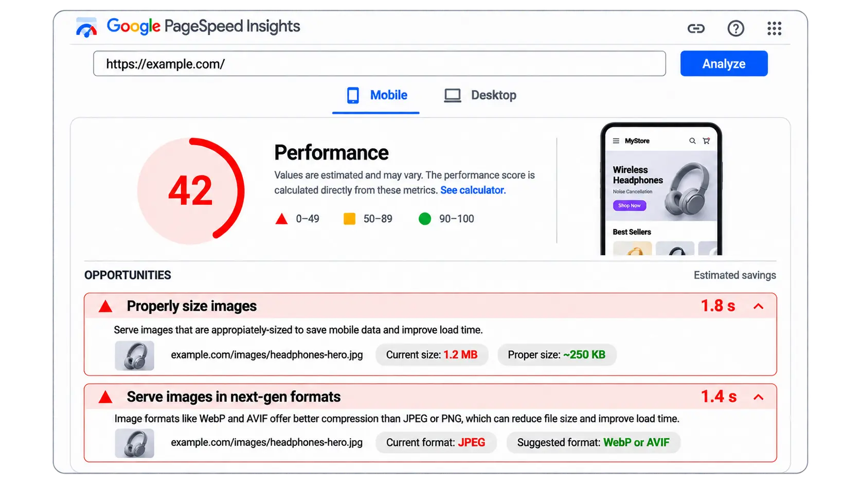
Do not guess. Open Google PageSpeed Insights, enter a key page, and read the mobile tab. Look for these audits: “Properly size images,” “Serve images in next-gen formats,” “Efficiently encode images” and “Defer offscreen images.”
Then find your Largest Contentful Paint (LCP) element. PageSpeed Insights names it. Google calls an LCP of 2.5 seconds or less “good,” measured at the 75th percentile of visits. If the LCP element is an image, that image is your first target.
Finally, open Chrome DevTools in phone view, pick a slow network profile and sort the Network tab by size. The top five images are usually the whole story. If the slow page is a product page, see why WooCommerce product pages are slow.
For a full library check, ThumbPress’s Detect Large Images tool scans every attachment against a size threshold you set (default 1 MB). It always measures the true original file, even when WordPress made a smaller display copy.
ThumbPress 6.9 also added an Image Checkup that shows which images need attention.
2. Resize Images to Their Mobile Display Size
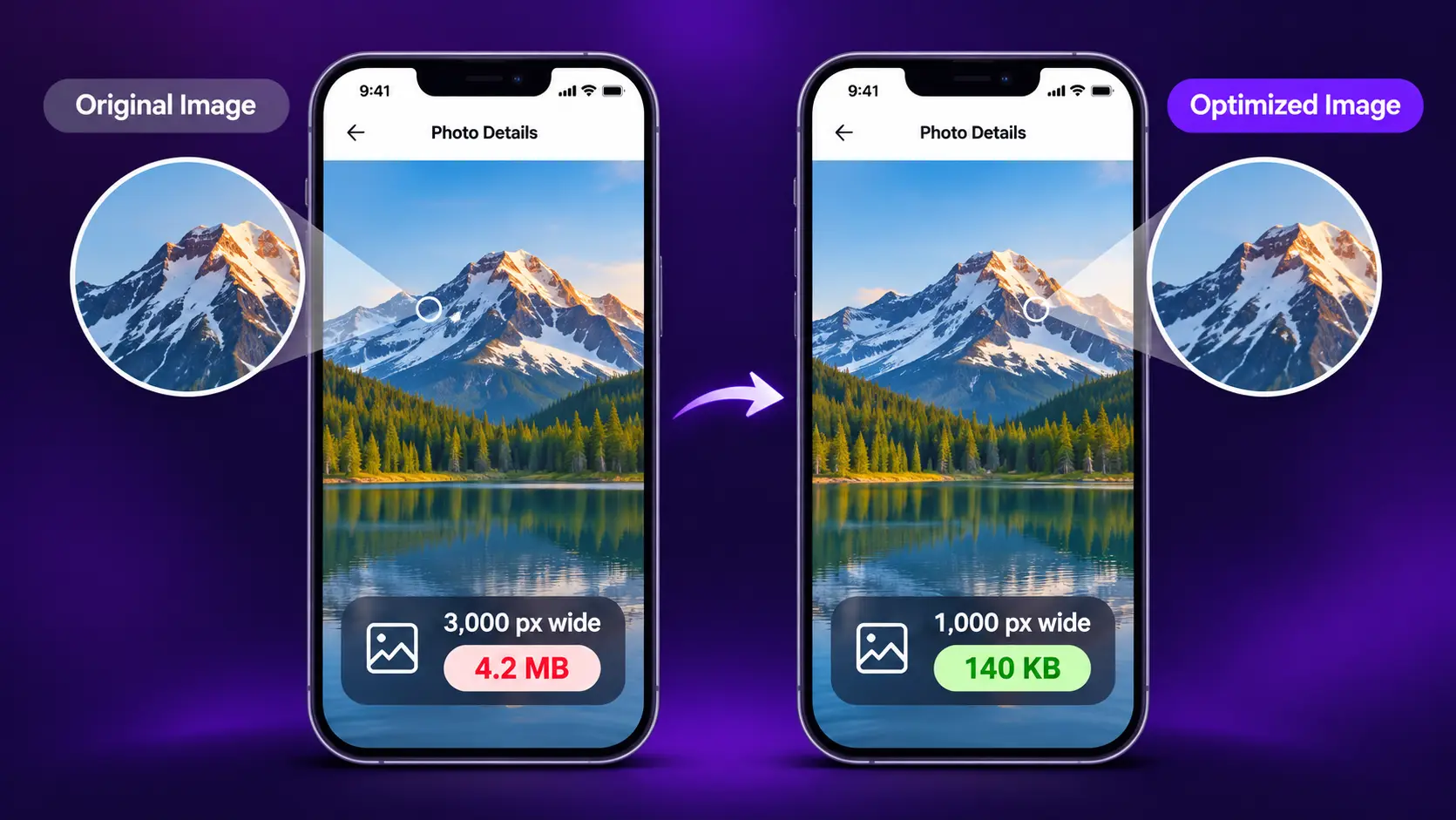
This is the biggest mobile win, and it costs nothing. A browser cannot shrink a file before downloading it. web.dev shows two copies of one photo, both displayed at 300 pixels wide. The 1,000-pixel version weighs 184 KB. The 300-pixel version weighs 16 KB. Same picture on screen, more than ten times the bytes.
DebugBear’s worked example shows the same effect: resizing one 4.3 MB photo to its display width dropped it to 495 KB, an 89% saving before any compression.
A practical rule: most phones show a full-width image at roughly 360 to 430 CSS pixels. Screens with 2x density need about twice that for a sharp result. So upload content images at around 800 to 1,200 pixels wide, not at camera size. Treat this as a rule of thumb and match it to your own theme’s content width.
3. Serve Responsive Images With “srcset”
Resizing once is good. Offering several sizes is better, so each device picks the right one. In plain terms, you hand the browser a menu of the same image in different widths, and it orders the smallest one that still looks sharp.
That menu is srcset, and sizes tells the browser how wide the image will be on screen. web.dev notes that browser support is above 90%, and unsupported browsers fall back to src.
WordPress does much of this for you. Since version 4.4, WordPress adds srcset and sizes to images it prints in post content, and it includes a 768-pixel medium-large size that suits phones. There are limits, though:
- Post thumbnails, galleries and other images printed outside post content may need extra code from your theme.
- The default sizes value may not match your layout.
- The medium-large size only exists for new uploads or after you regenerate thumbnails.
WordPress 6.7 added sizes=”auto” to lazy loaded images. That lets the browser use the real layout width instead of assuming the image spans the full screen, which avoids downloads that are bigger than needed.
If you write the markup yourself, keep an <img> tag with a src fallback, because Google notes that some browsers and crawlers do not read srcset.
So check your key pages. View the page source on a product gallery or a hero slider and confirm the image tag has a srcset. If it does not, your theme or builder needs attention. Running a store? Our WooCommerce image optimization checklist covers product galleries. Step 8 covers the thumbnail side of this.
4. Compress Every Image for Mobile
Compression strips redundant pixel data and hidden metadata such as camera details and GPS tags. It is the cheapest speed win in mobile image optimization after resizing.
ThumbPress gives you three ways to compress:
- Bulk compression (a Pro tool) works through your library in background batches with live progress and a cancel button, so large libraries finish without hitting a PHP time limit.
- Single image compression is one click from the media library, ideal for testing quality first.
- Auto-compress on upload optimizes every new image as it arrives, so the problem does not come back.
You choose lossy or lossless and set the quality from 1 to 100. Lossy suits photos. Lossless suits logos, screenshots and line art. Thumbnails are compressed alongside the original, and everything runs on your own server, with no per-image credits.
ThumbPress reports that photo-heavy libraries commonly shrink 40 to 70%.
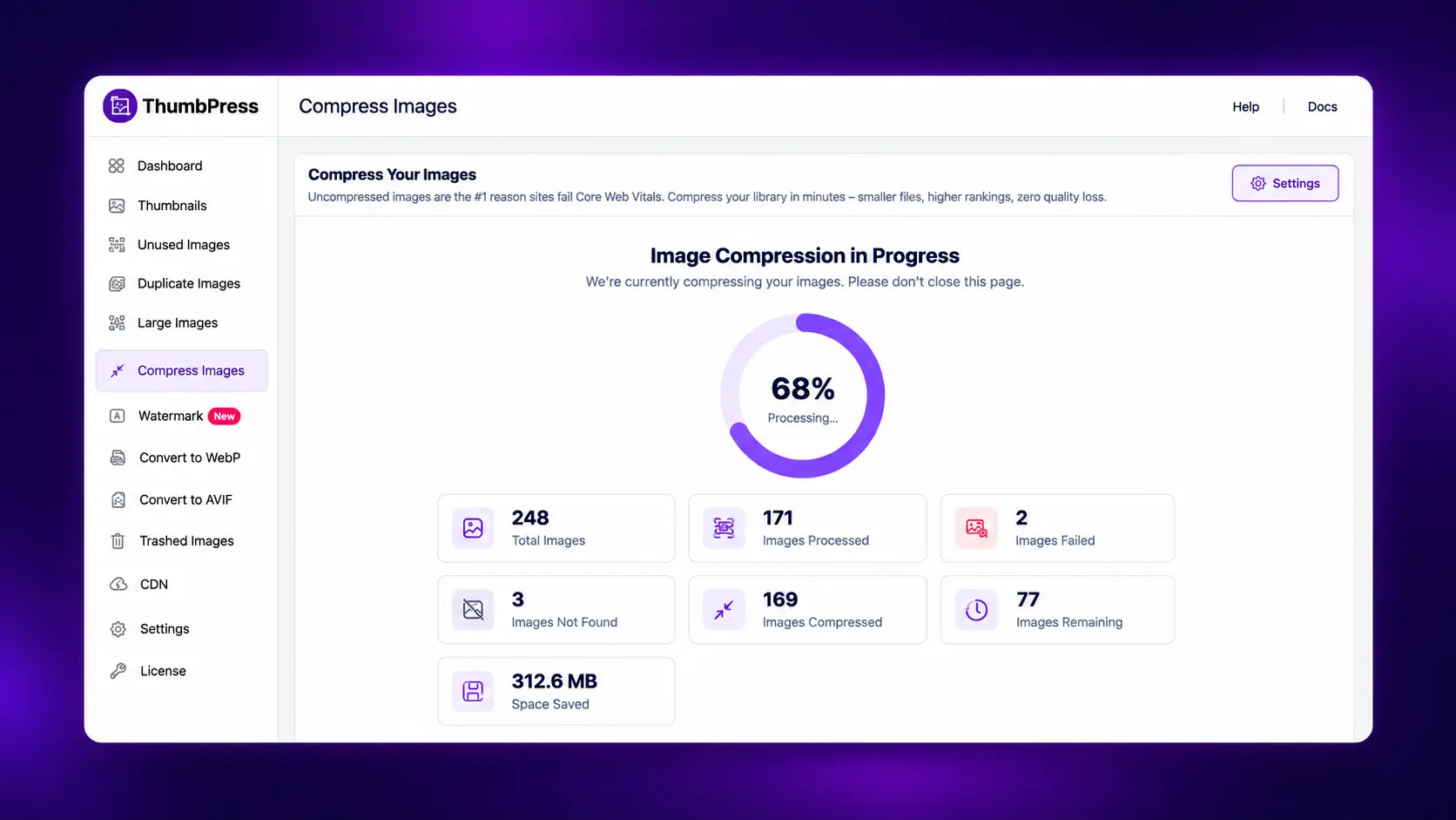
One warning: compressed images replace the originals and are not restored automatically. Take a full backup before your first bulk run, and test one image first. Quality set too low causes visible blur, so go lower only after checking the result on a phone.
5. Switch to WebP and AVIF
Modern formats carry the same picture in fewer bytes. Google says WebP lossy images are 25 to 34% smaller than comparable JPEGs at equivalent quality, and WebP lossless is 26% smaller than PNG. AVIF usually compresses better again, and ThumbPress cites roughly 20% over WebP.
Fewer bytes matter most on a slow mobile connection.
| Format | Size compared with JPEG | Best for |
| JPEG | Baseline | Legacy photo support |
| WebP | 25 to 34% smaller (lossy), per Google | Safe default for photos and graphics |
| AVIF | About 20% smaller than WebP, per ThumbPress | Maximum savings on photos |
ThumbPress converts images to WebP and AVIF. Our guide to using WebP images on WordPress covers the details, and AVIF vs WebP vs JPEG helps you pick between the three. Turn it on for new uploads, convert your existing library, then spot-check key pages on a real phone.
On the free plan, AVIF conversion covers future uploads only. Converting existing images fully needs Pro.
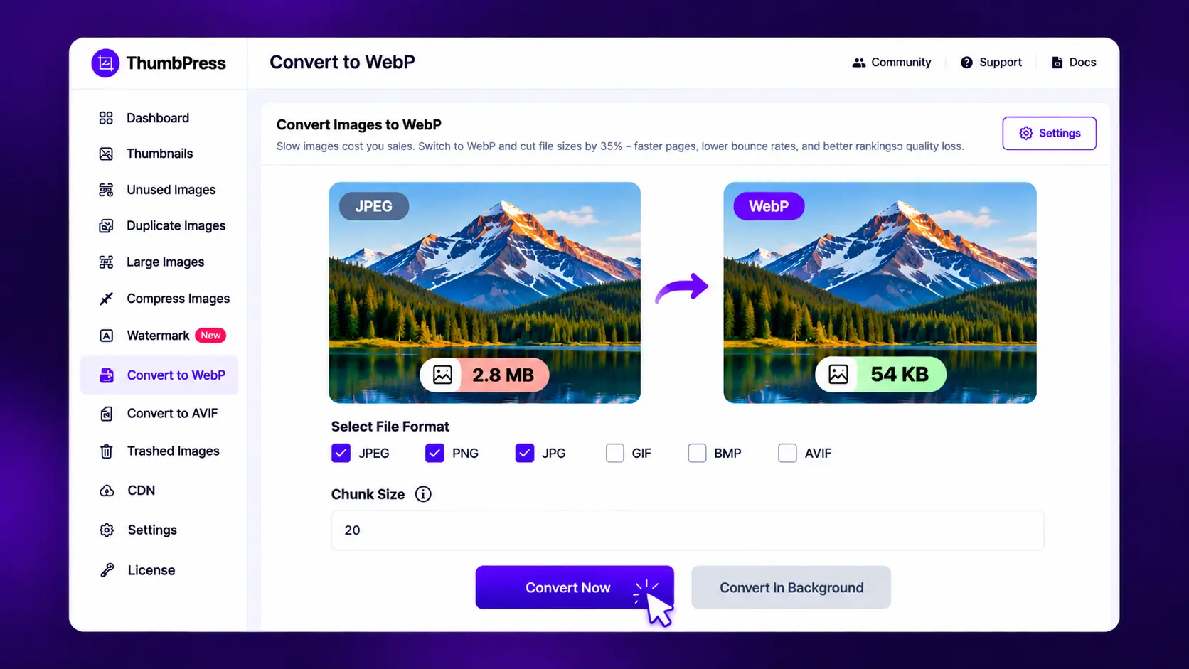
Try it on one image first. Install ThumbPress, compress a single photo, convert it to WebP and open the page on your phone. You will see the file size drop in under five minutes. Get ThumbPress
6. Lazy Load Below the Fold
Lazy loading tells the browser to skip images until a visitor scrolls near them. On a long mobile page, that saves a lot of data on the first screen. Since WordPress 5.5, core lazy loads images in post content, but as ThumbPress documents, images printed by your theme, page builder, sliders and custom fields can be missed.
ThumbPress Lazy Load Images adds the browser’s native loading=”lazy” attribute to those images. It uses no JavaScript, so images still appear if scripts are blocked. Leading images stay eager, using WordPress’s own threshold, so your hero image is not delayed.
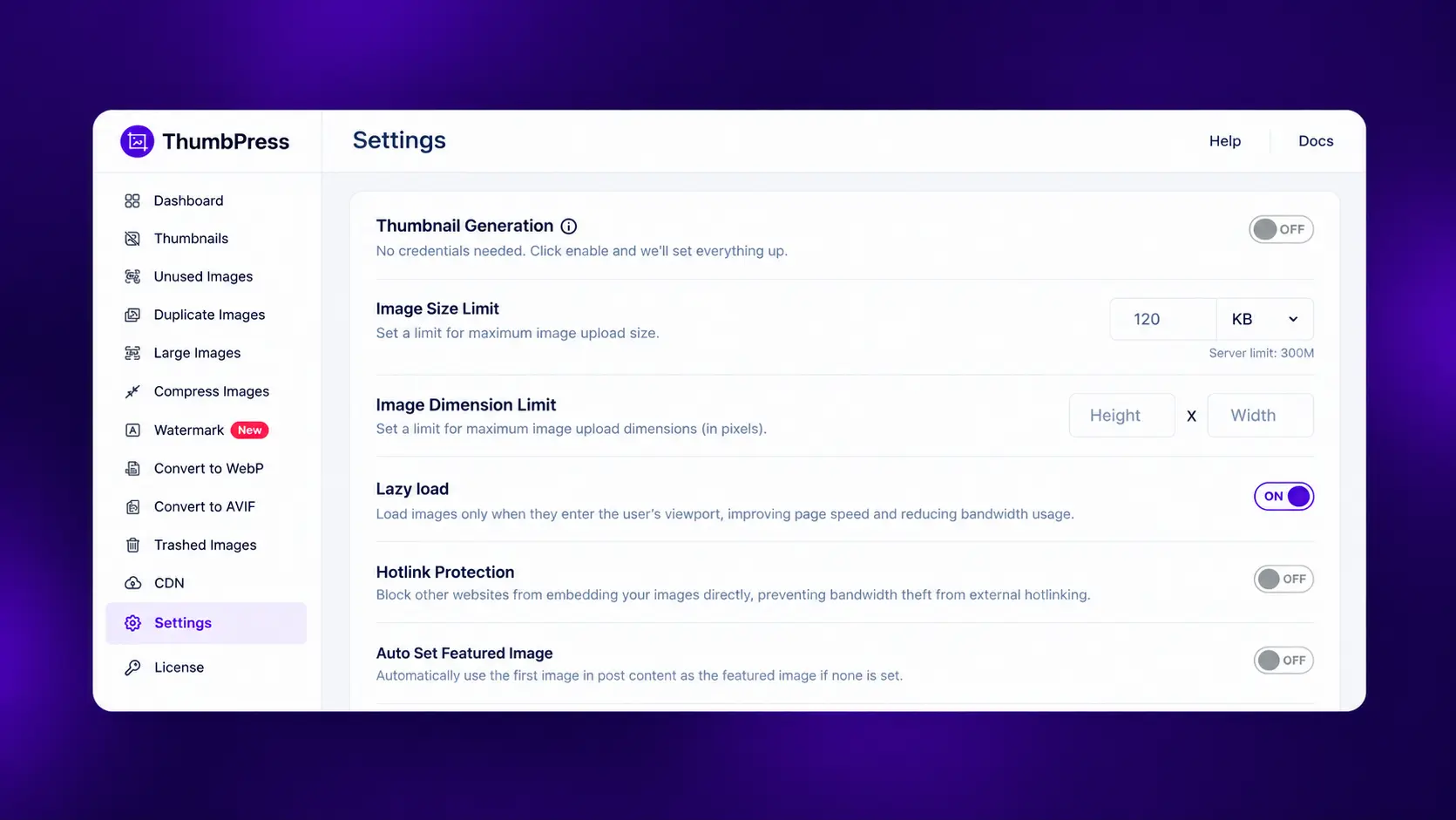
That matches web.dev’s advice to use loading=”lazy” only for images outside the initial viewport. Do not run two lazy loading features at once, because they can fight and cause flicker.
7. Never Lazy Load Your Main Image
This is the most common mobile mistake. Your top image is usually the LCP element. Delay it, and you delay the score Google reads.
The Web Almanac found that about 17% of mobile pages lazy load their LCP image. web.dev’s analysis found a typical (75th-percentile) LCP of 2,922 ms on pages without lazy loading and 3,546 ms on pages with it. That is a correlation, not proof.
WordPress core’s own testing found that skipping lazy loading for the first content image improved median LCP by about 7%.
The fix: load the hero eagerly and give it high priority. In a Google Flights test, setting fetchpriority=”high” on the LCP image improved LCP from 2.6s to 1.9s. The Web Almanac found that only about 17% of mobile pages with an image LCP set fetchpriority=”high”, so this is an easy edge. Many themes and page builders expose this as a setting on the hero or banner image.
8. Keep the Thumbnails Phones Use, Drop the Rest
Every upload makes copies in several sizes. Phones depend on the small and medium ones. The huge sizes and the leftovers from old plugins are what bloat your server. One WordPress.org reviewer reported a site that had picked up 21 thumbnail sizes over the years and cleared roughly 6,000 unnecessary thumbnails in seconds.
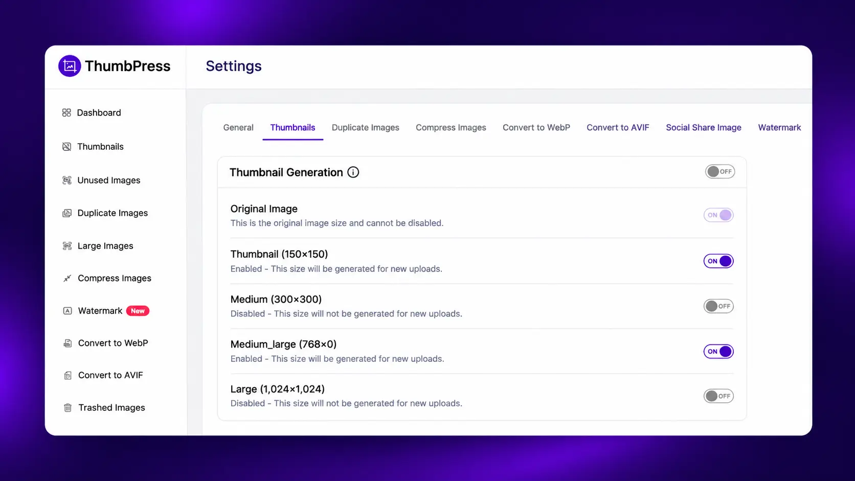
Open ThumbPress’s Disable Thumbnails tool. It lists every image size registered on your site by core, your theme or your plugins, and lets you untick the ones nothing uses. Keep the sizes your theme serves to phones. Then run Regenerate Thumbnails to rebuild your library against the sizes you kept.
Our guide to regenerating thumbnails in WordPress walks through it step by step. Regeneration also creates the medium_large size for older images, which helps srcset work on existing posts.
Disable one or two sizes at a time and check your key pages on a phone before removing more.
9. Deliver Images From a CDN
If your server is in Virginia and your visitor is in Dhaka, every image makes a long round trip. A CDN keeps copies on servers around the world and delivers from the nearest one. web.dev notes that switching to an image CDN can yield 40 to 80% savings in image file size, because the CDN also resizes and converts formats on the fly.
The ThumbPress Image CDN, on Pro plans, delivers your WordPress images from a global edge network with no DNS changes and no separate CDN account.
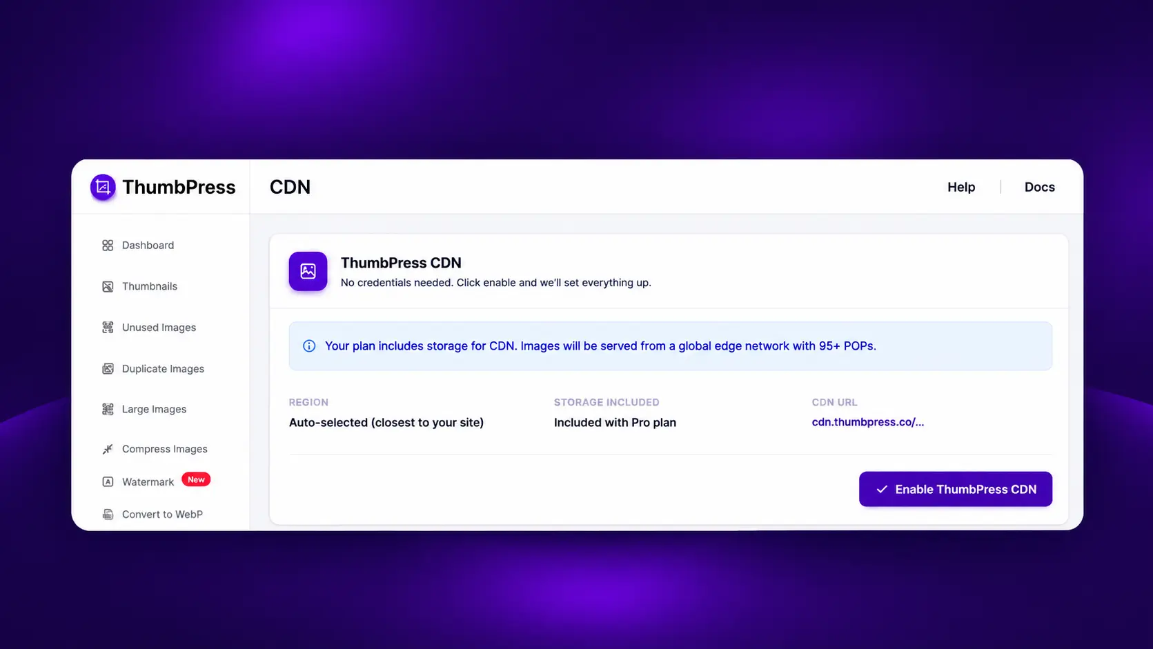
Here is how the ThumbPress Image CDN works. If you are weighing a CDN against plain optimization, our guide to CDN vs image optimization explains how they work together.
Mobile Image Optimization Cheat Sheet
Use these as rules of thumb, not hard limits.
| Image type | Pixel width (rule of thumb) | File size target | Format |
| Hero or banner | 1,200 to 1,600 px | About 150 KB or less | WebP or AVIF |
| Blog content image | 800 to 1,200 px | About 80 KB or less | WebP or AVIF |
| Product gallery image | 800 to 1,200 px | About 100 KB or less | WebP or AVIF |
| Thumbnail or card | 300 to 600 px | About 30 KB or less | WebP or AVIF |
| Logo or icon | As displayed | Very small | SVG or lossless |
What Are the Most Common Mobile Image Optimization Mistakes?
- Testing only on desktop. Office Wi-Fi hides the problem. Check the mobile tab in PageSpeed Insights.
- Compressing without a backup. Compression replaces the originals.
- Cropping away the subject. A wide banner can look fine on desktop and lose the product on a phone. Check the crop on a real device, and use the <picture> element if the phone needs a different crop.
Final Thoughts
Mobile visitors are the majority, and they judge your site by the first screen. To optimize images for mobile: measure first, resize, serve responsive sizes, compress, convert to WebP or AVIF, lazy load the right images, protect the hero, trim thumbnails and use a CDN.
ThumbPress puts every part of mobile image optimization in one plugin (compression, format conversion, thumbnail control, lazy loading and the Image CDN), so you do not juggle five tools or touch code. Install the free version to start trimming thumbnails today, or go Pro for bulk compression and the Image CDN. Every Pro plan has a 30-day money-back guarantee, so you can try it on your own site with no risk.
Get ThumbPress and optimize your images for mobile →
Frequently Asked Questions
Resize each image to the width it is displayed, compress it, and convert it to WebP or AVIF. Add responsive srcset markup so phones download smaller files, lazy load images below the fold, and serve them from a CDN. In WordPress, ThumbPress covers compression, format conversion, thumbnail control, lazy loading and CDN delivery in one plugin.
There is no single size. As a rule of thumb, a full-width image needs about 800 to 1,200 pixels for sharp results on 2x screens, and most content images should stay near 80 KB or less. Hero images can run a little larger. ThumbPress's Image Upload Limit helps stop oversized files before they reach your library.
WebP is the safe default because it is widely supported and Google reports lossy WebP files 25 to 34% smaller than comparable JPEGs. AVIF often compresses further, and Google Search supports both formats. ThumbPress converts images to both WebP and AVIF.
Look for a plugin that compresses images, converts them to WebP or AVIF, controls thumbnails, lazy loads and offers CDN delivery. ThumbPress covers all five in one dashboard, with bulk compression and the Image CDN on Pro plans. Test any plugin on one page and compare the mobile PageSpeed result before and after.
Within the limits you set. You choose lossy or lossless and a quality level from 1 to 100, and ThumbPress reports no visible quality loss at around 80. Test one image first. Because compressed images replace the originals, back up your library before a bulk run.
Because phones often get the same large files as desktops, over a slower connection and with less processing power. Resize images to their displayed width, add srcset, compress them and serve WebP or AVIF. Then retest in the PageSpeed Insights mobile tab, not the desktop tab.
Usually not. Responsive images let one set of files serve every device, because the browser picks the right size from the srcset list. A separate crop is only worth it when the subject gets lost on a small screen. Keep the same alt text and image URLs on both versions.
ThumbPress has a free version and Pro plans. The free version covers essentials such as thumbnail management, while Pro unlocks advanced tools such as bulk image compression and the Image CDN. Every Pro plan includes a 30-day money-back guarantee.